
In general, minimal design is overvalued – contrary to rich design 😉 This is especially true for desktop environments with a multitude of controls. It does not mean that minimal design is always bad, read on. In this evaluation I use “Napoleon in St. Helena”, better known as “Freecell”. Here is a somewhat scientific but simple approach to stimulate the brain.
Table of Contents
Abstraction
Is AIDS the wrath of god? Is vaccination a bad idea? Is 1 + 1 equal to 3? Separation of facts and fiction is everyone’s moral duty. And abstraction is part of that process. Just like your door handle is actually an interface that ensures that you can enter the next room. Here follows the abstraction of the “Napoleon in St. Helena” interface – what a fantastic name, think about it!
The interface? These are the cards to reach the goal: All cards per sort, ordered, on a pile in the top right corner. The means to do that consist of temporarily parking a maximum of 4 cards at the top left and moving cards to the bottom of the columns, descending, whereby the color must change between red and black each time.
Abstraction in that sense:
- There is a sequence in the cards
- The ace apparently acts as “1”.
- The jack, queen and king apparently as “11”, “12” and “13”.
- 4 sets of 13 cards are used.
- 2 sets of 26 cards are needed to be able to place alternately in columns.
- 4 sets are needed to place the cards on the top right.
Conclusions
- The interface elements contain a lot of illogical and redundant information if the game is played on a computer:
- Unnecessarily large cards.
- Why is the text also reversed on the card?
- Who is so illiterate that there must be 9 drawn spades on “spades 9”?
- The numbering is not logical.
- Why not “1” instead of the ace?
- Why not “11”, “12” and “13” instead of jack, queen and king? Or tridecimal (0 … 9, A, B, C)?
If you think about those points then you can draw further conclusions and reason why the 52-card game, excluding jokers, has been so popular over the centuries – even illiterates could play the game, but that aside.
Game goal: You want to play the game as quickly as possible and as well as possible. To the extent that card design plays a role, that design must be focused on that. The design above is fun, recognizable and nostalgic. However, it does not fit the game goal.
Alternative cards
That means we have to give the cards a facelift. A variant that is close to the traditional card game:

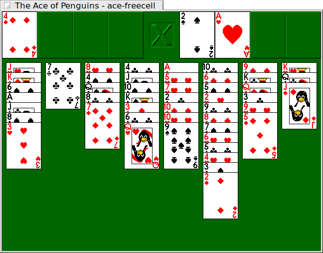
Are you curious about what that looks like? Shuffle cards and play. The following is an example. I played it on a CAD system, which of course is not really a nice environment to play. What struck me was that during the first (and last) game I was already used to working with numbers, colors and the font effect.

End notes
With that I think it is quite useful for a phone with a little screen, for example. It is a good example of minimal design where design is really functional. Finally, it is hopefully inspiring to apply abstraction more broadly, for example in business processes. If you look analytically at the things around you, they suddenly look very different.
Thinking about the obvious things, that turn out to be not so obvious, is fun. I stumbled upon “Mouse Cursor History (and why I made my own)“, yet another nice illustration of using brains.